Contender, Surrender and Pretender: SPDR Sector Analysis October 3,2010
- Posted by Greg Harmon
- on October 3rd, 2010
In reviewing the Select Sector SPDR funds I noticed that many of them have very similar charts on both the daily and weekly timeframe this week. The two major exceptions are the Energy Select Sector SPDR, XLE, and the Financials Select Sector SPDR, XLF. Let’s delve into these two funds on multiple timeframes.
Contender
Energy Select Sector SPDR, XLE Daily

Energy Select Sector SPDR, XLE Weekly

Energy Select Sector SPDR, XLE Monthly
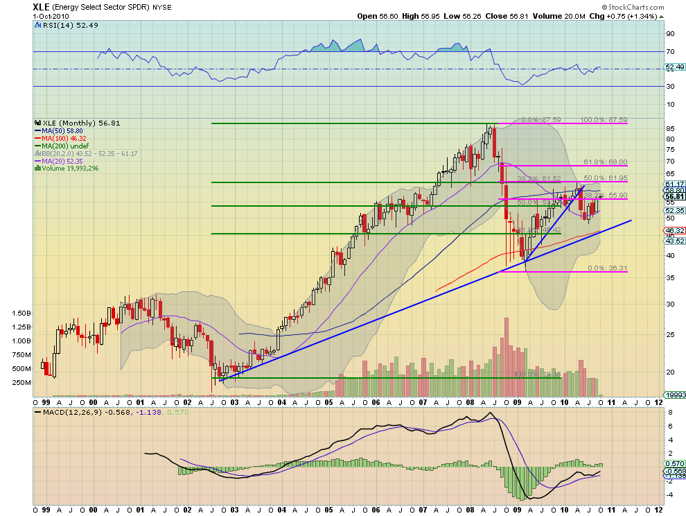
The Energy Select Sector SPDR, XLE, has been very interesting on a daily chart lately. I have been noting over the past few weeks the monthly cycle of mid-month peaks and lows near month end, as well as a potential WV pattern and series of lower highs over the last few months. All of this changed this week and for the better. Rather than fall to a low at month end it has risen to new recent highs, taking out the July and August highs and the 200 day Simple Moving Average (SMA). In doing so it appears to have given up it cyclical pattern. Additionally it is now near confirming the WV and looks ready for higher levels. The Moving Average Convergence Divergence (MACD) indicator and Relative Strength Index (RSI) are both rising adding to the bullishness. This is good news for all those who have been wondering when energy would participate in the rising market. It is now catching up. The weekly chart looks promising as well as price is crossing the 56.47 area that has been support and resistance previously. There is room to the 200 week SMA at 59.18 before running into some resistance and then more at the April highs near 61.50 above. The 50 week SMA looks like good support below the R/S line. Moving out to the monthly chart shows that the rising 20 month SMA is lifting it back above the 38.2% Fibonacci retracement of the move from 2008 highs to the 2009 lows. The 50 month SMA at 58.80 lines up well with the weekly resistance level of 59.18 and then a target of 61.95 as a 505 retracement. MACD and RSI are giving it a tailwind on both the weekly and monthly charts. This move up looks real.
Surrender
Financials Select Sector SPDR, XLF Daily

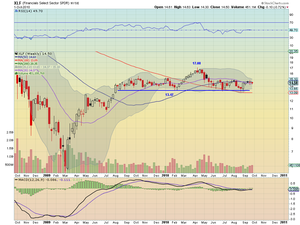
Financials Select Sector SPDR, XLF Weekly
Financials Select Sector SPDR, XLF Monthly
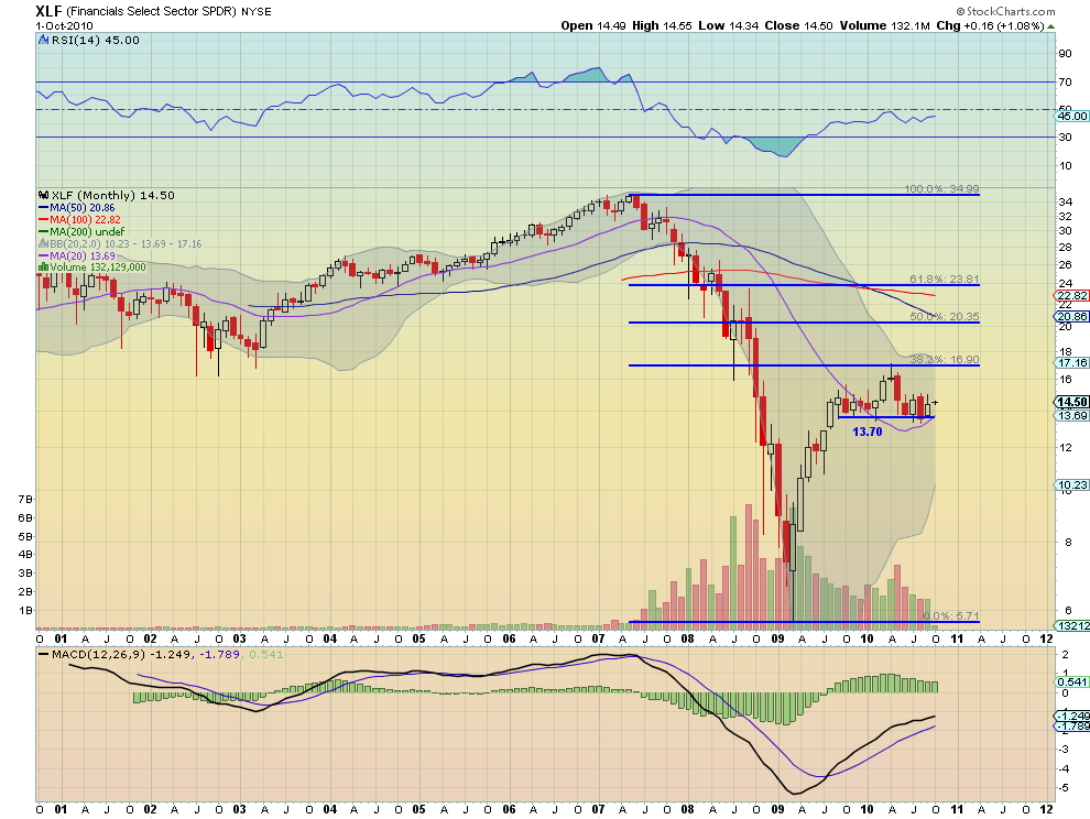
In comparison the Financials Select Sector SPDR, XLF, has been and continues to be in a range on the daily chart with a flat MACD and RSI at 50. There does not seem to be any impetus from the daily chart to get the financials participating in the recent rally. The resistance levels of 14.53, 14.78 and then 15.28, and support levels of 14.35, 13.80 and 13.48 have been fairly stable for several months. The same goes for the weekly chart. The range has been bounded by 13.47 on the downside and 15 on the top side since May. Here also the MACD is flat lined and the RSI dead on undecided at 49.70. Moving to the monthly chart does not give any more clarity as to the next move. What had been a rising MACD is now flat and may be rolling over and the RSI is near the mid line. The range is clear as well. There is one added piece of information that the peak earlier this year was at the 38.2% Fibonacci level retracement of the move from the 2007 highs to the 2009 lows. There is nothing in any of theses charts that indicates that the Financials are about to participate in the recent rally. How far can the rally continue without them?
Now as a proxy for the other 7 let’s also look at the Industrials Select Sector SPDR, XLI, that has an interesting view in multiple timeframes.
Pretender
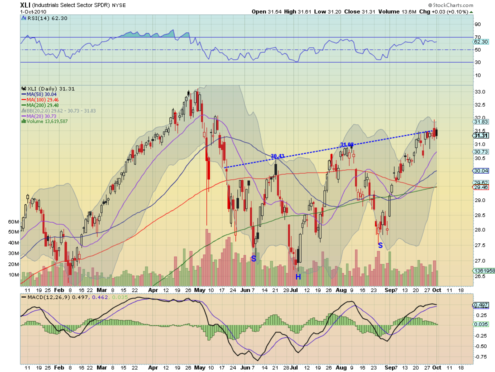
Industrials Select Sector SPDR, XLI Daily
Industrials Select Sector SPDR, XLI Weekly

On the daily chart it is stalling at neckline,31.60, of a four month Inverse Head and Shoulders pattern with at target of 35 if it can get through. But what makes it look similar to the other 6 Select Sector SPDR’s is the recent run up from mid-September has occurred with the MACD diverging. The weekly chart shows it breaking through a descending triangle and above the SMA’s. That is interesting but more interesting for the group of 7 funds is that they all show a recent move up on the weekly charts with a MACD that has been moving in tandem. This is positive for all 7 and increases the chances that the divergences in the daily MACD’s will reverse. The monthly charts for the 7 are not similar enough to review together.
The information that I take away from this is that the 7 sectors that has been taking this market higher are now becoming a bit uncertain. They are still in uptrends but consolidating or leveling off on the daily charts while they wait to see if Energy and Financials are going to participate. Energy definitely looks to be joining the party and could be enough tot restart a move higher. perhaps that could be the catalyst that pulls the Financials along. Or perhaps the market realizes that the Financials are not going to participate and starts to fade. This is the dilemma that I will be watching for resolution.
Trade’m well.
Specifics for all of the daily charts can be found in my twitter and chart.ly feeds.
If you like what you see above sign up for deeper analysis and trading strategy by using the Get Premium button above. As always you can see details of individual charts and more on my StockTwits page.
The information in this blog post represents my own opinions and does not contain a recommendation for any particular security or investment. I or my affiliates may hold positions or other interests in securities mentioned in the Blog, please see my Disclaimer page for my full disclaimer.
blog comments powered by Disqus
-
 Gregory W. Harmon CMT, CFA, has traded since 1986 and held senior positions including Head of Global Trading, Head of Product Development, Head of Strategy and Director of Equity. (More)
 -
Subscribe to Dragonfly Capital Views
Lifetime Subscription
$4,000.00Sign upAnnual Subscription
$1,000.00Sign upQuarterly Subscription
$350.00Sign up
Recent Posts
- Bull Scan for 10-14-26
- Premium Earnings 10-13-26: Fastenal and Morgan Stanley
- Bull Scan for 10-13-26
- Premium Earnings 10-12-26: Citigroup and Johnson & Johnson
- 4 Trade Ideas Wells Fargo: Bonus Idea
- 5 Trade Ideas for Monday: AbbVie, Airbnb, Affirm, GE Aerospace and Walmart
- Top Trade Ideas for the Week of October 12, 2026: The Rest Premium
- Top Trade Ideas for the Week of October 12, 2026: The Best
- SPY Trends and Influencers October 10, 2026
- Macro Week in Review/Preview October 9, 2026
Archives