A Quick Look at the SOX from the Forest to the Tree
- Posted by Greg Harmon
- on January 25th, 2011
The Philadelphia Semiconductor Index (SOX) and its components have gotten some press in the last two weeks, most of it negative. But is it deserved or just part of the rhythm of the markets? Let’s look at it action on 4 different timeframes to see if we can come to any conclusions.
SOX 12 Year Weekly Chart
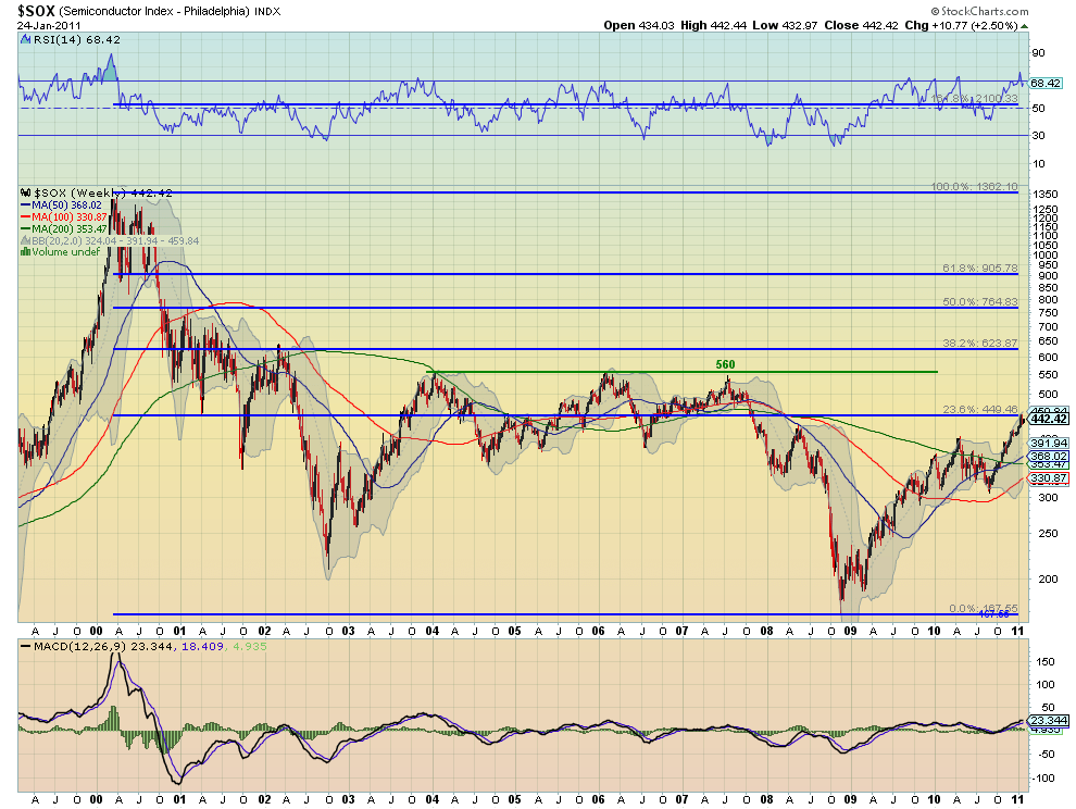
The 12 year timeframe was chosen in to illustrate the full fall from the top that marked the height of the dotcom bubble. There are a few points to note. First the SOX is just approaching a 23.6% retracement of that fall at 449.46. Second, there has been previous resistance at 560, nearly 25% higher than the current level, several times in the past. Finally, a 38.2% retracement of that epic move would put the SOX at 624, nearly 40% above its current level. There is still plenty of upside left in this run from a long term perspective. Now lets close in a bit and look at the last 5 years.
SOX 5 Year Weekly Chart
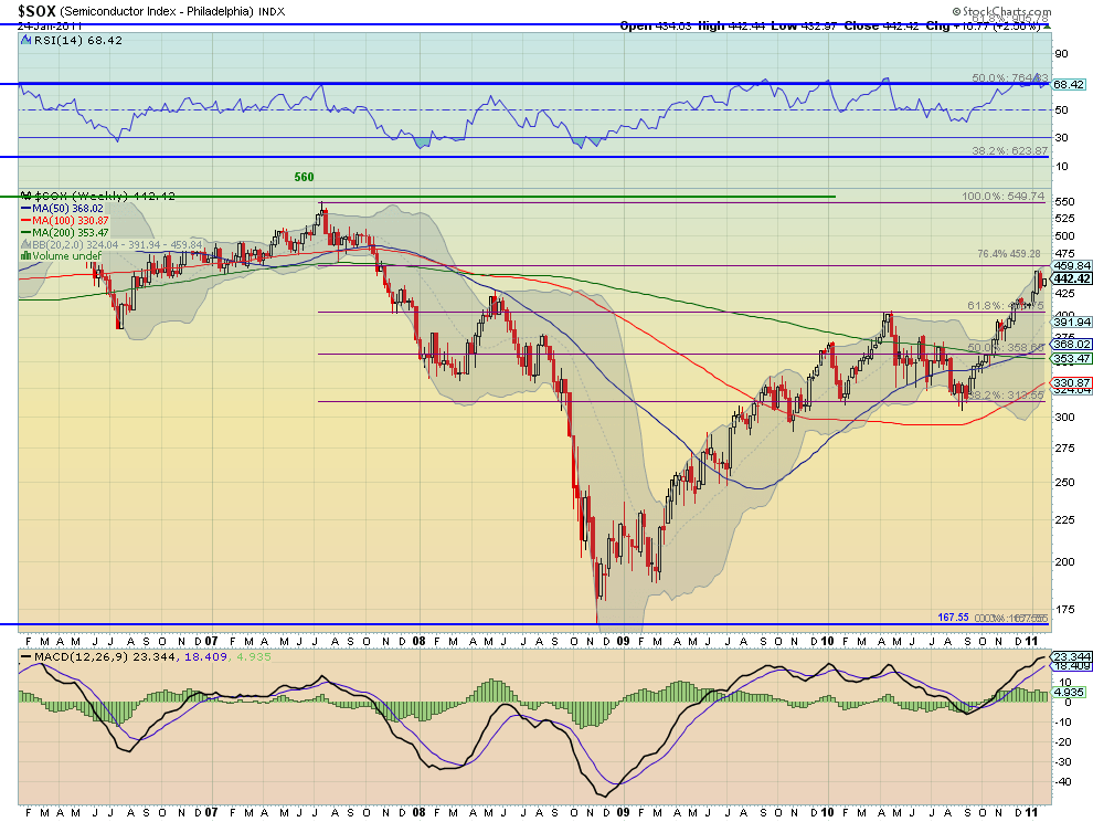
This period represents the fall from the the consolidation zone in 2007 to today. This chart shows how the move off of the bottom bounced at a 61.8% retracement back down to the 38.2% level and now higher through the 61.8% level again and now consolidating just below the 76.4% retracement level of 459.84. Again, there is more upside left to the 100% retracement and nothing horrible in this chart. Now lets close in further to the 1 year weekly chart.
SOX 1 Year Weekly Chart

A quick couple of points from this chart. First, the SOX consolidated at the 61.8% retracement before moving higher stalling when it hit the top Bollinger band. Second the three inside candles to finish the series keep the bullish bent to the Index. Now finally the 6 month daily chart.
SOX 1 Year Weekly Chart
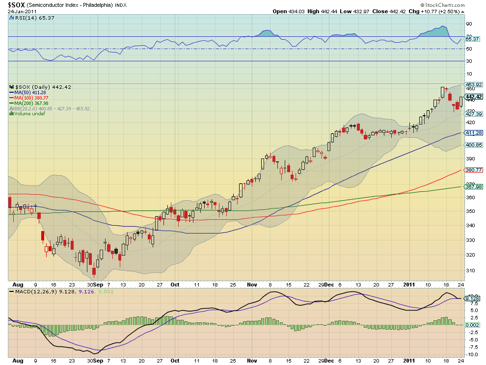
This is the chart that is causing all the uproar. Starting with the breach of the top of the Bollinger Bands early in the new year there were calls for a pullback. These continued as the Index remained above the top Band and the Relative Strength Index (RSI) reached the high 80’s, an overbought signal. This was followed by relief when it fell every day last week and talk of a tech sell off, even as the RSI worked off the overbought condition. Monday the SOX reversed higher and and the RSI followed.
Taken as a portfolio these charts are still very bullish and should not cause concern. There will always be pullbacks along the way during a rally. This is healthy. So is the hype just media induced frenzy? Or is it a sign of the skittishness of the market, counter to what you would infer from a sentiment survey? Either way, any concern about the Semiconductor sector seems unwarranted from the actual index action.
As always you can see details of individual charts and more on my StockTwits feed and on chartly.)
If you like what you see above sign up for deeper analysis and trading strategy by using the Get Premium button above. As always you can see details of individual charts and more on my StockTwits page.
The information in this blog post represents my own opinions and does not contain a recommendation for any particular security or investment. I or my affiliates may hold positions or other interests in securities mentioned in the Blog, please see my Disclaimer page for my full disclaimer.
blog comments powered by Disqus
-
 Gregory W. Harmon CMT, CFA, has traded since 1986 and held senior positions including Head of Global Trading, Head of Product Development, Head of Strategy and Director of Equity. (More)
 -
Subscribe to Dragonfly Capital Views
Lifetime Subscription
$4,000.00Sign upAnnual Subscription
$1,000.00Sign upQuarterly Subscription
$350.00Sign up
Recent Posts
- Premium Earnings 10-13-26: Fastenal and Morgan Stanley
- Bull Scan for 10-13-26
- Premium Earnings 10-12-26: Citigroup and Johnson & Johnson
- 4 Trade Ideas Wells Fargo: Bonus Idea
- 5 Trade Ideas for Monday: AbbVie, Airbnb, Affirm, GE Aerospace and Walmart
- Top Trade Ideas for the Week of October 12, 2026: The Rest Premium
- Top Trade Ideas for the Week of October 12, 2026: The Best
- SPY Trends and Influencers October 10, 2026
- Macro Week in Review/Preview October 9, 2026
- Bull Scan for 10-12-26
Archives