Pointing the Way Higher
- Posted by Greg Harmon
- on March 28th, 2011
Pullback. Correction. Distant memories now. Everyone has their Bull market horns back on again and who can blame them. Just look at the chart below of the bullish price objectives for each fund using Point and Figure Charts (PnF).
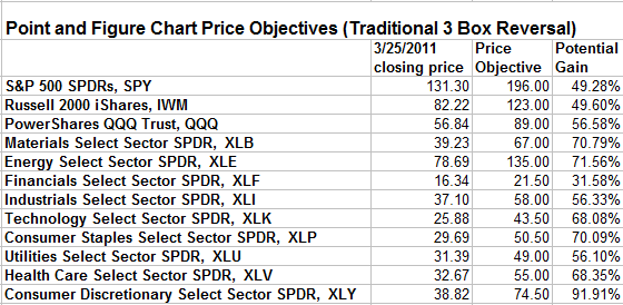
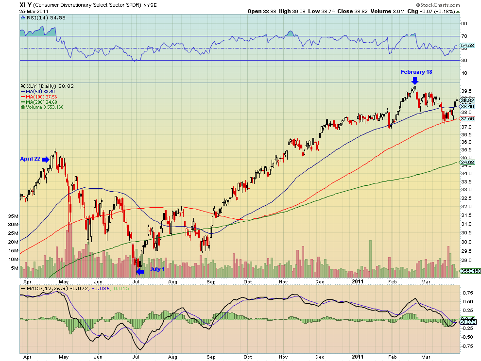
Price Objectives of anywhere from 31% to over 90% higher. I first used a version of this chart Saturday to illustrate that the longer term bullishness in the market. Time to just buy everything and go on vacation? Well not so fast. PnF charts give an unbiased estimate of future moves but they do have some drawbacks. First like any forecast the price objective is not always met. Second and more important, they give no insight at all to the timing to attain a price objective. If you are looking for that 49% return on the $SPY it may happen next week or it may take years to get there. That can make life difficult for a money manager getting paid paid over a short timeframe or an investor looking for short term exposure. Third they do not show the path that for attaining the target. As an example look to the candlestick chart of Consumer Discretionary Select Sector SPDR, $XLY, below. The current price objective for the XLY of 74.50 has been in place since it was created on April 22, 2010. If you bought it on April 22, 2010 at the closing price of 35.09 you would have suffered more than a 17% loss by July 1, 2010 when it reached 29.01, but the price objective was still 74.50. Could you stomach that type of a correction? If you did then the move higher to the February 18, 2011 high at 39.88 rewarded you handsomely.
Finally, when a reversal occurs they can create large percentage lower price objectives in just a few box move. So should you avoid PnF Charts? No, they give valuable insight about the long term trend. But adding a stop loss to you plan can help avoid some of the noise when there have been big runs. Keep them as a tool in your technical analysis shed but be mindful of the potential short run pitfalls.
As always you can see details of individual charts and more on my StockTwits feed and on chartly.)
If you like what you see above sign up for deeper analysis and trading strategy by using the Get Premium button above. As always you can see details of individual charts and more on my StockTwits page.
The information in this blog post represents my own opinions and does not contain a recommendation for any particular security or investment. I or my affiliates may hold positions or other interests in securities mentioned in the Blog, please see my Disclaimer page for my full disclaimer.
blog comments powered by Disqus
-
 Gregory W. Harmon CMT, CFA, has traded since 1986 and held senior positions including Head of Global Trading, Head of Product Development, Head of Strategy and Director of Equity. (More)
 -
Subscribe to Dragonfly Capital Views
Lifetime Subscription
$4,000.00Sign upAnnual Subscription
$1,000.00Sign upQuarterly Subscription
$350.00Sign up
Recent Posts
- Bull Scan for 10-13-26
- Premium Earnings 10-12-26: Citigroup and Johnson & Johnson
- 4 Trade Ideas Wells Fargo: Bonus Idea
- 5 Trade Ideas for Monday: AbbVie, Airbnb, Affirm, GE Aerospace and Walmart
- Top Trade Ideas for the Week of October 12, 2026: The Rest Premium
- Top Trade Ideas for the Week of October 12, 2026: The Best
- SPY Trends and Influencers October 10, 2026
- Macro Week in Review/Preview October 9, 2026
- Bull Scan for 10-12-26
- How this Week’s Premium Top 10 Performed, October 9, 2026
Archives