Trade What You See Not What You Hear – Works for Metals Too
- Posted by Greg Harmon
- on February 24th, 2011
Thursday was an interesting day in the markets, especially looking at the metals. The big boys, Gold and Silver, seemed to just fall off a cliff at 2:15 pm and sucked in a ton of volume in doing so. As this happened Copper just watched, by the way. There will be a lot written tomorrow about how rumors of demise of the Libyan dictator caused the sell off, just like the claims that the initial unrest there caused the rapid rise. So if it was a rumor responsible for driving Gold today, I guess you buy it back tomorrow on the dip, right. You may be right but the chart says otherwise.

The chart above for the Gold ETF, GLD, broadcast 4 signals that it is topping. First, the massive Bearish Engulfing candle. If confirmed would trigger a downside target of at least 133.79. Next the Relative Strength Index (RSI) rejected at the technically overbought level and is now sloping and pointing downward. Third, the Moving Average Convergence Divergence (MACD) indicator peaked and fell back slightly. Finally, the price fell strongly back into the Bollinger bands and you can see what happened the last three times this occurred. A fifth indicator is on the way but not confirmed yet with the falling 50 day Simple Moving Average (SMA) about to cross down through the 100 day SMA. A failure to make a new high tomorrow will confirm the bearish indicators. By the way note that Gold signaled its rise in the charts well before the unrest. So follow the charts or the news, hmmm.
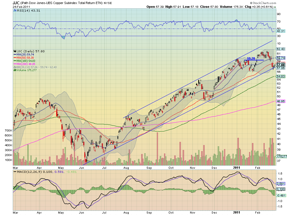
Meanwhile, remember Copper just sat and watched the precious metal melt down. The intraday chart for JJC, the Copper ETF, was a very tight slightly upward sloping flat line. But the daily chart below shows that flat price action had some very positive meaning. The price held the bottom rail of a one year long rising channel after testing it for a second day. It also closed with a bullish candle riding the Bollinger band higher. As this happened the RSI has turned higher, leaving only the MACD to join the bullish party. If it continues to hold this rail then a move higher above the 50 day SMA and towards the 20 day SMA at 59.74 can be anticipated. This seems low risk as there are two levels of support, the rail and the Bollinger band.
So there you have two trades for tomorrow, but if you really want to kick it up a notch, look at the pairs trade between the two. The chart below is a ratio chart of JJC vs GLD. Now this is an exciting chart. The ratio fell out of the Bollinger bands and caught support of the 100 day SMA with a bullish hollow red candle. It is now back inside the Bollinger bands. The MACD has peaked in the negative direction and is improving. And the RSI has J-hooked higher. look for this ratio to rise up to 0.445 at least, possibly 0.452. The trade here is to buy 7 lots of JJC and sell 3 lots of GLD for a net credit of $4.84 for each shape traded. Then using 0.417 as a stop (risking about $6.35) ride the spread until the ratio reaches the target for a profit at 0.445 of $19.77-$20.54 per shape. That is a reward to risk ratio of greater than 3.1:1.

(As always you can see details of individual charts and more on my StockTwits feed and on chartly.)
If you like what you see above sign up for deeper analysis and trading strategy by using the Get Premium button above. As always you can see details of individual charts and more on my StockTwits page.
The information in this blog post represents my own opinions and does not contain a recommendation for any particular security or investment. I or my affiliates may hold positions or other interests in securities mentioned in the Blog, please see my Disclaimer page for my full disclaimer.
blog comments powered by Disqus
-
 Gregory W. Harmon CMT, CFA, has traded since 1986 and held senior positions including Head of Global Trading, Head of Product Development, Head of Strategy and Director of Equity. (More)
 -
Subscribe to Dragonfly Capital Views
Lifetime Subscription
$4,000.00Sign upAnnual Subscription
$1,000.00Sign upQuarterly Subscription
$350.00Sign up
Recent Posts
- Bull Scan for 10-13-26
- Premium Earnings 10-12-26: Citigroup and Johnson & Johnson
- 4 Trade Ideas Wells Fargo: Bonus Idea
- 5 Trade Ideas for Monday: AbbVie, Airbnb, Affirm, GE Aerospace and Walmart
- Top Trade Ideas for the Week of October 12, 2026: The Rest Premium
- Top Trade Ideas for the Week of October 12, 2026: The Best
- SPY Trends and Influencers October 10, 2026
- Macro Week in Review/Preview October 9, 2026
- Bull Scan for 10-12-26
- How this Week’s Premium Top 10 Performed, October 9, 2026
Archives