What’s Happening on the Front Lines? Ask the General
- Posted by Greg Harmon
- on January 9th, 2011
I previously looked at The Winners and Losers on the Battlefield , but what is happening on the front lines?
The Front Lines
But what about the rest? The sectors slugging it out day in and day out to determine whether they go up or down. Those sectors on the front lines. Energy Select Sector SPDR, XLE, Financials Select Sector SPDR, XLF, Utilities Select Sector SPDR, XLU, and Consumer Discretionary Select Sector SPDR, XLY are fighting that battle now. And in the trenches it may not be clear where these sectors are heading. Each has had their own unique week of battles.
The General’s Perspective
 Whenever the daily charts show some confusion it is wise to step back and look at the broader picture. Where the soldier fighting the battle is just concerned with surviving to fight another day, the General, perched high on the hill, has the perspective to see a prevailing trend. Let’s look at these sectors with the General’s perspective.
Energy Select Sector SPDR, XLE
XLE has been the lead driver of the rally from September. The longer term trend from the daily chart has been straight up along the 20 day SMA. But this past week it has shown some kinks in its armor. Look at the two charts below showing the daily and weekly activity for XLE.
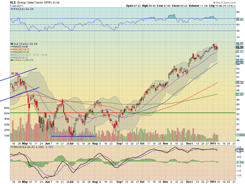
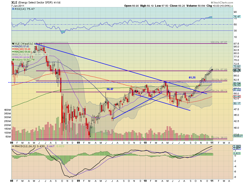
The daily chart is consolidating with a MACD cross lower and a falling RSI from an overbought level. Is it at the top about to rollover or is it just a bull flag working off the overbought condition before heading higher. The perspective of the weekly chart gives some clues. From this chart two concepts are clear. First, the trend is still strong and higher. Second this weeks stall or pullback coincides with a 61.8% retracement of the move down from Summer of 2008 highs to the lows of march 2009, and an area where there was previous support and resistance on that journey. Expect more stickiness at this level to continue in the short run before the trend can continue.
Financials Select Sector SPDR, XLF

The daily chart above shows that the XLF had a gap up Monday and trend higher, but a big red candle with a long shadow Friday filling the gap, before finishing the week higher. The RSI is falling and the MACD looks ready to cross. Is the Friday Hanging Man candle a bearish omen or does filling the gap set the stage for a run higher? The perspective of the weekly chart below gives some clues.
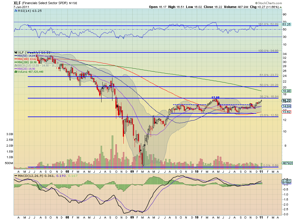
This chart is much more bullish. The big red volume candle from the daily chart has been transformed into a long green candle on the weekly. The RSI is rising and has plenty of room before reaching any overbought signals. The MACD is also increasing. Expect another test of the 16.84 level a 38.2% retracement of the move down from June 2007 to the March 2009 low, before long.
Utilities Select Sector SPDR, XLU

The daily chart for XLU shows that it has been moving sideways for a couple of weeks but with a widening range this past week, with long lower shadows. The MACD has been falling but the RSI has been in a range in bullish territory. Does the wide range with falling MACD signal a fall to happen or does the RSI holding with the rising 20 day SMA show the way higher? To the weekly chart.
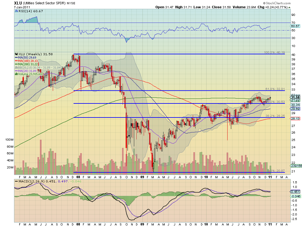
The General’s view shows several interesting features occurring. First, this battle is happening right at the 200 week SMA, a reasonable source of resistance. Next, the bounce in November came off of the 50% retracement level of the move from December 2008 to March 2009 and now has some room to the 61.8% retracement level higher. Third, the RSI and MACD are both improving adding to the bullish case. Next, the 20 week SMA is about to cross higher through that 200 week SMA. More bullish news. Look for this sector to move higher and when through the October highs then test the 61.8% Fibonacci level.
Consumer Discretionary Select Sector SPDR, XLY
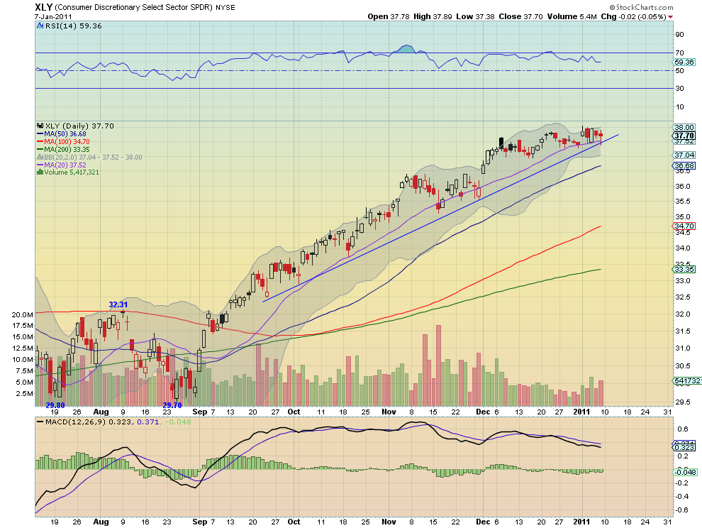
The daily chart for XLY shows consolidation since early December on decreasing volume. It is also now testing the nearly 4 month rising support line and the flattening 20 day SMA. The MACD is slightly negative but stable and the RSI has s slight downward slope but remains in bullish territory. Does the flattening 20 day SMA crossing the support trend line signal an impending fall? Or will the trend hold and springboard the sector higher? The perspective of the weekly chart gives some clues.
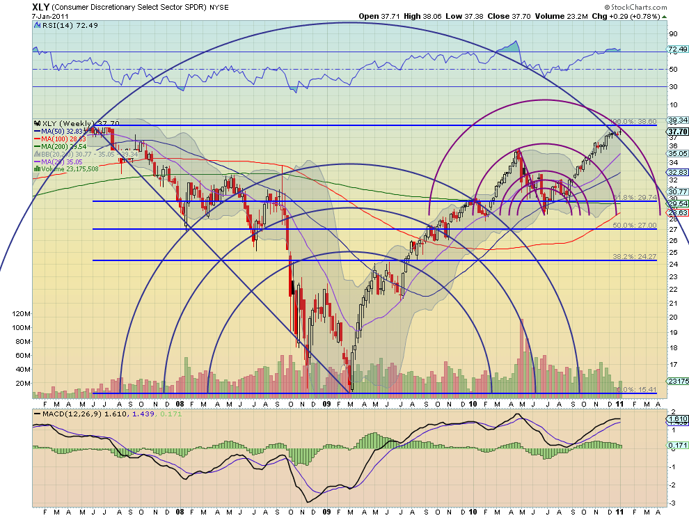
This chart has two sets of Fibonacci arcs in addition to the Fibonacci retracement levels from the mid 2007 highs to the March 2009 lows. The maroon arcs represent the retracement of the move down from April through June of 2010. Here there are three potential resistance areas coming together in the same space. It is nearly at the 100% retracement of the big down move and between both arcs. This may need to spend a few more weeks consolidating or possibly experience a slight pullback before it clears this tangle. Either way not the best place to put money in the near term.
Next time you are confused by a chart remember that even if you are a Soldier in the battle, a day or swing trader, get the perspective of the General to be better prepared.
Trade’m well.
(As always you can see details of these individual charts and more on my twitter feed and on chartly.)
If you like what you see above sign up for deeper analysis and trading strategy by using the Get Premium button above. As always you can see details of individual charts and more on my StockTwits page.
The information in this blog post represents my own opinions and does not contain a recommendation for any particular security or investment. I or my affiliates may hold positions or other interests in securities mentioned in the Blog, please see my Disclaimer page for my full disclaimer.
blog comments powered by Disqus
-
 Gregory W. Harmon CMT, CFA, has traded since 1986 and held senior positions including Head of Global Trading, Head of Product Development, Head of Strategy and Director of Equity. (More)
 -
Subscribe to Dragonfly Capital Views
Lifetime Subscription
$4,000.00Sign upAnnual Subscription
$1,000.00Sign upQuarterly Subscription
$350.00Sign up
Recent Posts
- Bull Scan for 10-14-26
- Premium Earnings 10-13-26: Fastenal and Morgan Stanley
- Bull Scan for 10-13-26
- Premium Earnings 10-12-26: Citigroup and Johnson & Johnson
- 4 Trade Ideas Wells Fargo: Bonus Idea
- 5 Trade Ideas for Monday: AbbVie, Airbnb, Affirm, GE Aerospace and Walmart
- Top Trade Ideas for the Week of October 12, 2026: The Rest Premium
- Top Trade Ideas for the Week of October 12, 2026: The Best
- SPY Trends and Influencers October 10, 2026
- Macro Week in Review/Preview October 9, 2026
Archives