Use More Crayons!
- Posted by Greg Harmon
- on December 2nd, 2010
It is often useful to step back from a messy cluttered situation. To simplify the picture by removing what is no longer important or useful and get down to the core of an issue. This applies to looking at charts as well as other aspects of your daily life.
But there are times when what at first appears irrelevant on closer inspection adds clarity to the picture. Look at the chart below for the Energy Select Sector SPDR, XLE.
Energy Select Sector SPDR, XLE
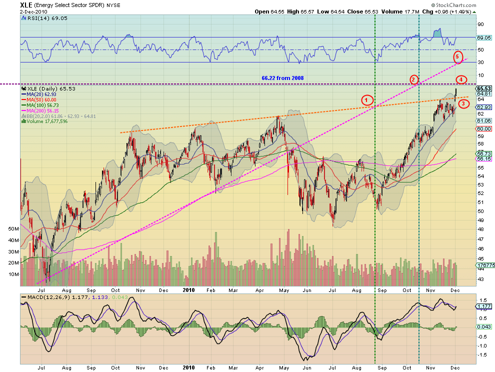
First notice the orange trend line touched in October 2009 and May 2010 and nearly in January of this year. Second draw your attention to the pink rising trend line that is touched in July 2009 and February and May 2010 before being breached lower setting off a down trend. Many would stop these lines when price broke the rising wedge created by the combination of the two. But look at the 5 additional pieces of information that could have been gleaned from this chart if you had continued these lines forward.
1. The first piece of information came when these two lines crossed in late August. Notice that otherwise the indicators (Simple Moving Averages (SMA’s) , Moving Average Convergence Divergence (MACD) and Relative Strength Index (RSI)) did not seem to play a major role, yet this marked a bottom and the beginning of a run higher in price, RSI and MACD.
2. Follow the purple resistance line that has been extended from the two touches in May and August of 2008 at 66.22, crosses the rising extended pink trend line again where the SMA’s, MACD and RSI seemed innocently watching. Perhaps the RSI was moving lower but that in itself would probably not initiate a trade. At this junction the price rise stalled, had a slight pullback and went sideways.
3. The extended orange line became resistance again in November and RSI peaked and fell and then later a jumping off point for a break out December 1st.
4. and 5. Are left as resistance points to the at break out going forward.
Without extending and retaining these trend lines none of these signals would have been evident. So go ahead and use your crayons to create a colorful collage. The more nuanced information you can obtain just might make you some money.
Trade’m well.
(As always you can see these individual charts and more on my twitter feed and on chartly.)
If you like what you see above sign up for deeper analysis and trading strategy by using the Get Premium button above. As always you can see details of individual charts and more on my StockTwits page.
The information in this blog post represents my own opinions and does not contain a recommendation for any particular security or investment. I or my affiliates may hold positions or other interests in securities mentioned in the Blog, please see my Disclaimer page for my full disclaimer.
blog comments powered by Disqus
-
 Gregory W. Harmon CMT, CFA, has traded since 1986 and held senior positions including Head of Global Trading, Head of Product Development, Head of Strategy and Director of Equity. (More)
 -
Subscribe to Dragonfly Capital Views
Lifetime Subscription
$4,000.00Sign upAnnual Subscription
$1,000.00Sign upQuarterly Subscription
$350.00Sign up
Recent Posts
- Bull Scan for 10-14-26
- Premium Earnings 10-13-26: Fastenal and Morgan Stanley
- Bull Scan for 10-13-26
- Premium Earnings 10-12-26: Citigroup and Johnson & Johnson
- 4 Trade Ideas Wells Fargo: Bonus Idea
- 5 Trade Ideas for Monday: AbbVie, Airbnb, Affirm, GE Aerospace and Walmart
- Top Trade Ideas for the Week of October 12, 2026: The Rest Premium
- Top Trade Ideas for the Week of October 12, 2026: The Best
- SPY Trends and Influencers October 10, 2026
- Macro Week in Review/Preview October 9, 2026
Archives