Sector Review: The Good, the Bad and the Ugly through RSI
- Posted by Greg Harmon
- on November 13th, 2010
Once again a review of the SPDR Sector ETF’s shows a segmentation on the daily timeframe. In the recent market pause or pullback there have been some sectors that have held up well, others that appear ready to give up the trend and those that have lost it. They can be separated easily into 3 groups by looking at the Relative Strength Index (RSI). This gives rise to this week’s theme: The Good, the Bad and the Ugly.
The Good

Three sectors have held up well this past week. These are Materials Select Sector SPDR, XLB, Energy Select Sector SPDR, XLE, and Consumer Discretionary Select Sector SPDR, XLY. Below are the daily charts:
Materials Select Sector SPDR, XLB

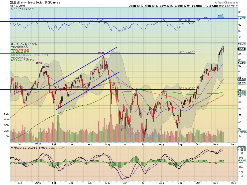
Energy Select Sector SPDR, XLE
Consumer Discretionary Select Sector SPDR, XLY
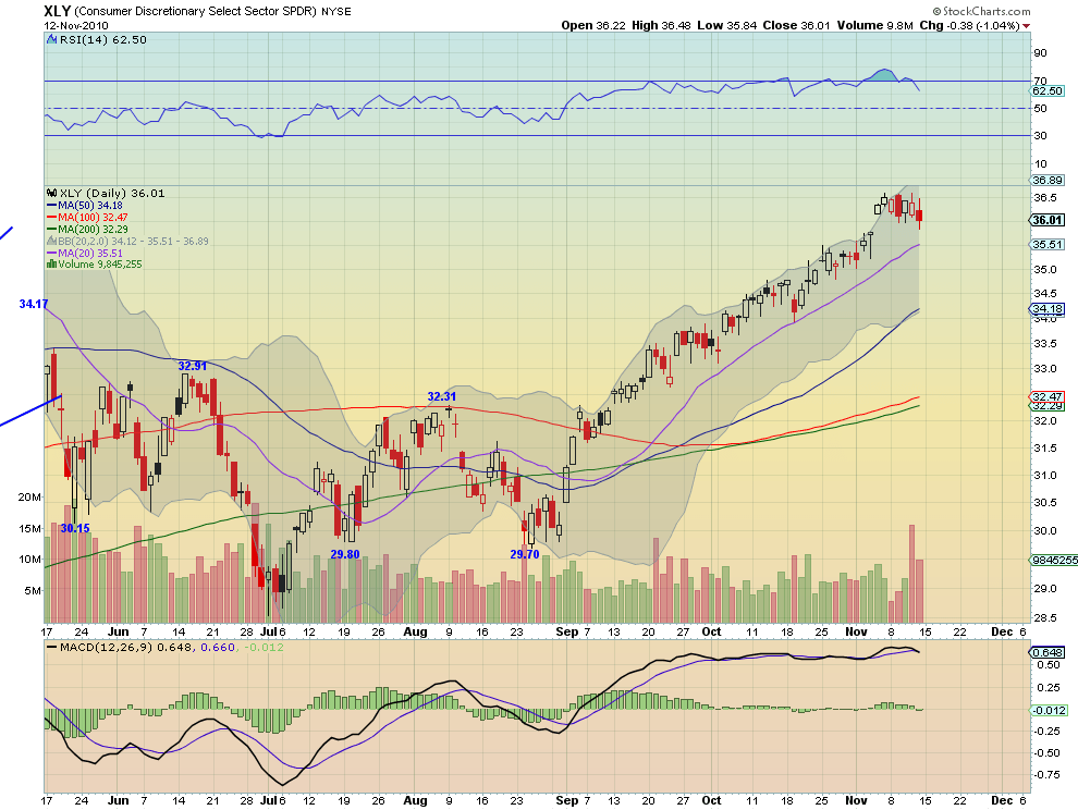
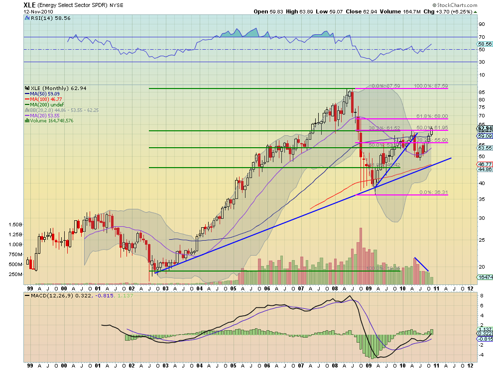
Each of these sectors gapped up after the election and has held the gap on a closing basis. The RSI is high and has been, well above 50, since crossing that level when the rally began. XLE is the strongest with the short term trend still higher and a Moving Average Convergence Divergence (MACD) indicator that is positive, but has felt some pain with the RSI falling sharply from an overbought level, but to a still high level of 72.19. That in itself is not a bad thing. XLE on a weekly and monthly chart is also looking strong with an uptrend on the weekly and a bullish Three Advancing White Soldiers pattern on the monthly, assuming this months candle completes near where we are now (weekly and monthly charts at the end). XLB is the weakest of the 3 with an RSI of only 56.06, but has not had a test of the 50 level yet. I expect that if the pullback continues that these sectors will hold up the best and that XLE will be the last to give it up.
The Bad

The next group of sectors has already filled that post-election gap and moved lower. This group includes Financials Select Sector SPDR, XLF, Industrials Select Sector SPDR, XLI, Technology Select Sector SPDR, XLK and Consumer Staples Select Sector SPDR, XLP. Two of the charts are posted below, XLF and XLK.
Financials Select Sector SPDR, XLF

Technology Select Sector SPDR, XLK
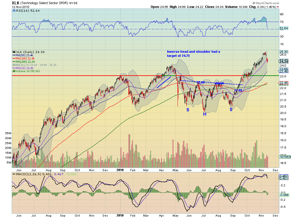
All four sectors have RSI approaching 50, a level that has held since it was crossed to the upside when this rally began in September. look at the RSI for XLK. 50 RSI was crossed in July 2009 at the beginning of the rally from July 2009 through January 2010, and was support throughout that rally. Also the period between May 2010 and August 2010 saw that RSI could not hold over 50 for any prolonged period of time, as the price oscillated. Finally once it broke and held above 50 in September the rally started again. XLI and XLP have a similar RSI profile relative to price. The RSI for XLF has been a sign of price direction with 50 being stability of price and pushes above 50 coinciding with rising prices, dips below 50 coinciding with falling prices. They all might hold near the 50 RSI level. Price action will determine any trend change, not RSI, but it is giving a warning. If they fall below it is not automatically the end of the uptrend for XLI, XLK and XLP, but I fear for XLF under 50 RSI.
The Ugly

This group contains the Utilities Select Sector SPDR, XLU, and Health Care Select Sector SPDR, XLV. The chart for XLU is below.
Utilities Select Sector SPDR, XLU

XLU is a good example to use to illustrate why these two sectors are ugly. It had a long run higher from July through to late October. During this run the RSI was strongly over 50 and held support there several times. The rally lost strength on a first break of RSI 50 and it has RSI below 50 and falling now. XLV has a similar profile. But RSI is only one reason these sectors are ugly. XLU and XLV have lost support of some Simple Moving Averages (SMA’s) lately. Both have MACD indicators that are growing more negative and have lost historical price support levels. These sectors look to fall further.
The Good, the Bad and the Ugly. keep this analysis in mind as you plan for the coming week. Perhaps a little music will help you remember.
(As always you can see details of these individual charts and more on my twitter feed and on chartly.)
Energy Select Sector SPDR, XLE Weekly

Energy Select Sector SPDR, XLE Monthly
If you like what you see above sign up for deeper analysis and trading strategy by using the Get Premium button above. As always you can see details of individual charts and more on my StockTwits page.
The information in this blog post represents my own opinions and does not contain a recommendation for any particular security or investment. I or my affiliates may hold positions or other interests in securities mentioned in the Blog, please see my Disclaimer page for my full disclaimer.
blog comments powered by Disqus
-
 Gregory W. Harmon CMT, CFA, has traded since 1986 and held senior positions including Head of Global Trading, Head of Product Development, Head of Strategy and Director of Equity. (More)
 -
Subscribe to Dragonfly Capital Views
Lifetime Subscription
$4,000.00Sign upAnnual Subscription
$1,000.00Sign upQuarterly Subscription
$350.00Sign up
Recent Posts
- Bull Scan for 10-14-26
- Premium Earnings 10-13-26: Fastenal and Morgan Stanley
- Bull Scan for 10-13-26
- Premium Earnings 10-12-26: Citigroup and Johnson & Johnson
- 4 Trade Ideas Wells Fargo: Bonus Idea
- 5 Trade Ideas for Monday: AbbVie, Airbnb, Affirm, GE Aerospace and Walmart
- Top Trade Ideas for the Week of October 12, 2026: The Rest Premium
- Top Trade Ideas for the Week of October 12, 2026: The Best
- SPY Trends and Influencers October 10, 2026
- Macro Week in Review/Preview October 9, 2026
Archives