Repair vs. Replace: Dorman Products vs. Ford
- Posted by Greg Harmon
- on January 19th, 2011
The difference between these companies is that Ford (Ticker: F) makes cars and sells them and Dorman Products makes repair parts for when they break. With the economy picking up you might think that this would make for a great pairs trade. Buy Ford and short Dorman since more people can buy new cars instead of repairing their old ones. But what does the price action say?
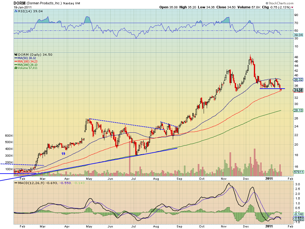
Above is the chart for Dorman Products. DORM peaked in early December and has pulled back over 25%. But the technicals still look still look pretty ugly. The stock price had been consolidating in a bear flag with a base of 35 and top of about 38.50. That changed Wednesday breaking the support at 35 with a lower level in the Relative Strength Index (RSI). The Moving Average Convergence Divergence (MACD) indicator also just crossed lower, adding too the bearish mood. There is support at the 100 day Simple Moving Average (SMA) at 34.23 but underneath that the next support is at 32 and then around 28.50 from October. This chart indicates the easy path is still lower.
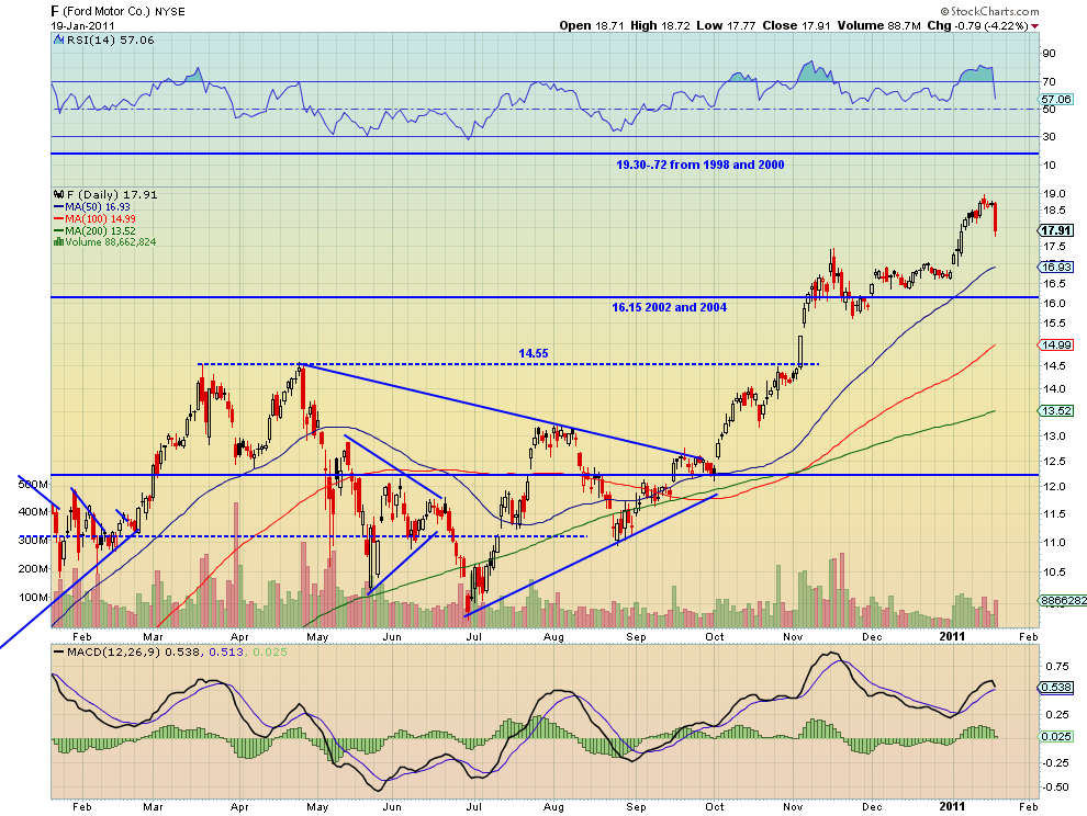
Now look at the chart of Ford. F rose out of a nice base from December recently to a high of 18.97 last week. Wednesday it fell off of a cliff though. Perhaps this was forecast by the elevated RSI over 80 and the rolling MACD indicator. Despite working off the overbought RSI, this stock is also looking like it has more downside. The MACD is about to cross lower and the 20 day SMA as support is much lower at 16.93.
Both look lower, what does that do to the original premise. Below is the ratio chart of the two stocks.
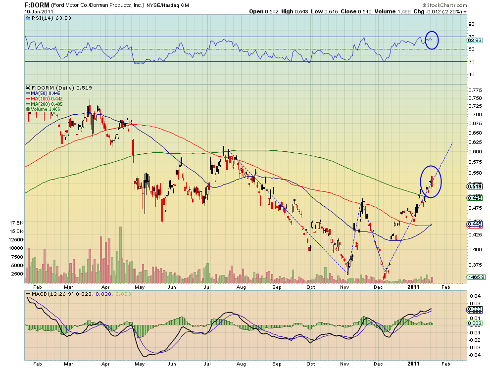
This ratio has been in a classic ‘W’ pattern with a target of 0.615 or higher. But today’s bearish engulfing candle suggests a move lower may be coming. The RSI unable to get above the 70 level is in agreement. Conflicting signals, trend higher but significant downside red flags. What to do? Easy, don’t take the pairs trade. Sure, you could wait for confirmation tomorrow or in a few days. You could also just short both stocks and be happy. After all, the charts above are both bearish right? The point is that the obvious economic argument is not playing out in the price action. Good thing we looked at the charts before acting.
Trade’m well.
(As always you can see details of individual charts and more on my StockTwits feed and on chartly.)
If you like what you see above sign up for deeper analysis and trading strategy by using the Get Premium button above. As always you can see details of individual charts and more on my StockTwits page.
The information in this blog post represents my own opinions and does not contain a recommendation for any particular security or investment. I or my affiliates may hold positions or other interests in securities mentioned in the Blog, please see my Disclaimer page for my full disclaimer.
blog comments powered by Disqus
-
 Gregory W. Harmon CMT, CFA, has traded since 1986 and held senior positions including Head of Global Trading, Head of Product Development, Head of Strategy and Director of Equity. (More)
 -
Subscribe to Dragonfly Capital Views
Lifetime Subscription
$4,000.00Sign upAnnual Subscription
$1,000.00Sign upQuarterly Subscription
$350.00Sign up
Recent Posts
- 5 Trade Ideas for Tuesday: Bank of NY, BorgWarner, Estee Lauder, Intel and Micron Technology
- Top Trade Ideas for the Week of September 8, 2026: The Rest Premium
- Top Trade Ideas for the Week of September 8, 2026: The Best
- SPY Trends and Influencers September 5, 2026
- Macro Week in Review/Preview September 4, 2026
- Bull Scan for 9-8-26
- How this Week’s Premium Top 10 Performed, September 4, 2026
- Bull Scan for 9-4-26
- The World Runs on Oil (Substack repost for Lifetime members)
- Premium Earnings 9-3-26: DocuSign and lululemon
Archives